


Responsive web design is a new way of designing websites, but what is it? A responsive website is built on a fluid proportion based grid that allows your site to adapt to any device or browser. This means one site works across the board for all devices. So whether you’re looking at site on a desktop or a mobile device, you are looking at the same site. Say bye-bye to clunky mobile sites that cause you to lose content and key features from your desktop site and say hello to a streamlined user experience that bridges the gap between desktop and mobile browsing.
Responsive sites are exactly that, responsive. Your site will resize automatically to whatever type of device it is being viewed on. This means you in essence have a smart site that knows whether a phone, computer monitor or tablet is displaying it. The way the site is displayed will change depending on the resolution and size of the screen you are viewing it on. A good example would be Starbucks.com, open it with your browser on your desktop or laptop and slowly shrink the size of your browser. You will notice the layout of the screen change as the browser shrinks.
This is the full menu from the desktop view of Starbucks.com website.

This is the tablet view of the menu.

This is a smaller tablet view of the menu. You can see the size of the logo changes and a button on the top menu disappears.

Some of the largest companies in the world have recognized the value of this technology; Disney, Microsoft, and even the Boston Globe all have responsive sites. These companies have seen the shift towards the post-desktop era, and the rise of the mobile search. Last year alone, mobile searches made up about 30% of all search traffic, and in some industries like restaurants and tourism that number is close to 50%. Think about it, most of the time these days if you’re searching for directions somewhere, or for a good restaurant, chances are you’re doing it on your mobile device.
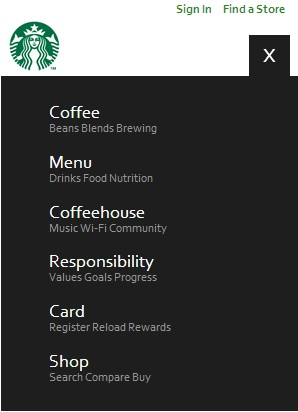
This is the smart phone view of the menu. You will notice the three bars on the right, that is now the menu button.
Here you will see the expanded menu once clicked (tapped).
Within the next two years, mobile searches will overtake desktop searches and if your website isn’t mobile ready, your company will be left in the dust. Responsive web design streamlines the web development process to allow for one universal website for all viewers to see. So quit messing with mobile sites and join the responsive revolution.