


You finally got your website launched, your website traffic is kicking butt, but your conversion just isn’t turning out the way you hoped it would. Identifying the reason why your site is not converting can be frustrating and it can feel close to impossible to solve. The truth is, there are many factors why no one is clicking your sign up button.
In this article, I want to focus on one factor that commonly gets overlooked and, dare I say, abused at times. It’s critical for us that our visitors click on our signup buttons, so naturally, it is normal to want to emphasize it in every way we can. The problem begins when our investment in what that button can produce becomes skewed to the point that we visually overemphasize the button. This causes us to make drastic design decisions that change your call to action into a distraction more than a functional conversion tool.
You have most likely seen this happen on many websites where the call to action has unbalanced significant visual weight; wrapped in bold colors such as strong reds, blues or greens accompanied by large bold text and outlined in this glowing thick borders. While this does make the button visibly clear, it tends to visually isolate itself and can harm its association with the content and overall goal.
The real power is in visual balance. The placement, surrounding relevant content and, design are all influencers in the success of your call to actions.
So what does a “could be better” call to action look like? Below is an example:
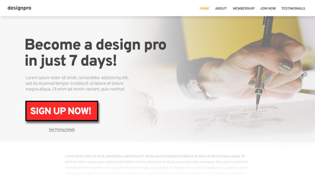
Now, I’ll admit, this is a bit of an exaggeration but you’d probably be surprised to know that this approach is more common than you’d think. It’s clear in this example the original thought was to ensure that at any cost the button is visible; and while this absolutely accomplishes that, it also becomes a distraction. It breaks the visual harmony of the hero in a negative way and could in turn potentially deter visitors from clicking the button.
A different approach, which may seem obvious, is the example below.
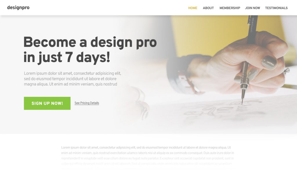
While we aren’t reinventing the wheel with this approach, neither is it uncommon to see this approach in most websites or even pre-built website templates, it’s easy to miss the subtleties happening with this button.
First, the button size was reduced. While we do want our button to have visual power and weight, by reducing the size of the button relative to the letter height of the headline text, we indirectly categorize the headline and the CTA in the same family of importance.
Second, we changed the button color. This was most likely one of the more obvious things to do compared to the “bad” example. But we didn’t just turn the button green, a specific tone of green was chosen to not only match the overall color tone of the website design but to avoid any harsh visual competition with the rest of the website design.
Third, button position was adjusted. While the button itself did not move much, by resizing the button and relocating the “See Pricing Details” link, we’ve now given the button a visual hierarchy. The button’s size now seems bigger than it is because we have a significantly smaller (yet just as important) link next to it.
Short of the color change, most of the adjustments made to this button were simple, non-destructive towards the design and overall converted the button to a more inviting call to action.
In conclusion, there are tons of factors that play into the success of a call to action. While this may not be as critical as copywriting or placement on a page, retaining visual harmony plays a significant role in not only call to action elements but all elements and information displayed on a web design.