


Understanding what is and isn’t a logo is equally important – as well as the current design trend in logos. Surveying the marketing field for logos would show a vast majority of logos using simplified color schemes (2-3 colors at most) and largely void of gradient effects and shimmers all too regularly seen in the unforgotten Web 2.0 era of the mid-late 2000’s.

- A logo must be simple. A simple logo allows for easy recognition and allows the logo to be versatile and memorable. Effective logos feature something unexpected or unique without being overdrawn.
- A logo must be memorable. Following closely behind the principle of simplicity is that of memorability. An effective logo should be memorable and this is achieved by having a simple yet appropriate logo.
- A logo must be versatile. An effective logo should be able to work across a variety of mediums and applications.
- A logo must be appropriate. How you position the logo should be appropriate for its intended purpose.
- A logo must be enduring. An effective logo should endure the test of time. The logo should be ‘future proof’, meaning that it should still be effective in 10, 20, 50+ years time.
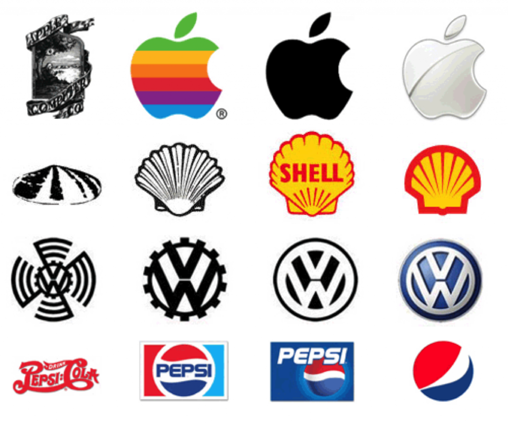
- But a logo can evolve. Showing a stubbornness not to evolve or update your logo can make your company look behind the times in comparison to the competition landscape.
Beveling or embossing some text in Photoshop does not a logo make. Heck. Photoshop should never be used to make a logo. And unknowingly to the casual observer, typeface can make all the difference in a logo. Ever wonder why TV and movie credits look slightly better than standard Arial or Helvetica on a medium? Google: kerning.
The following would not be considered logos in our book: