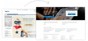
Websites are not static moments in time. They are dynamic, ever growing organisms that require constant attention to ensure that they continue to do their job and remain effective towards your business goals. While design is only one of many determining factors of a website’s success, there is no doubt it’s one of the most important ones.
Does the design of your website feel out of date?
Since mobile phones and tablets arrived on the scene, website design has been on the rise, constantly changing and evolving to not only better relay our messages in all shapes and sizes, but utilize the new design trends and techniques. To keep it simple, if you can see your website’s age, it’s absolutely time to update its design. Your website should not only feel up to date, but convey your brand’s image effectively.
While there are some design trends that are short lived and not worth adapting, there are some that have become standard and almost expected by your visitors. Clear legible typography, proper use of descriptive photography, and appropriate use of color and visual organization are at minimum a must when redesigning your website.
AWWWARDS has a great article discussing 6 Web Design Trends You Must Know for 2015 & 2016 that are definitely worth taking a look at.
Is your content difficult to find?
It’s no secret that if your website is hard to navigate visitors will leave – no questions asked! A well-designed user interface can make all the difference in visitor bounce rate and leads. While beautifully designed navigation systems with overly creative functionality can look and feel great, it may break the expectations of your visitors.
In turn, this can cause interruptions to their search flow which would ultimately deter them from navigating deeper into your website. When you’re exploring options for your website’s navigation system, keep a strong focus on functionality and UI standards. Keep beautiful design as a complimenting second focus to your navigation system.
Checkout this article by WebDesignerDepot.com on Essential Navigation Patterns in 2016.
Does your website translate well on all devices?
It’s 2016, and everyone is expecting to be able to visit your website on their phone or tablet without any trouble. If your website is NOT mobile responsive, you need a web redesign. Mobile responsiveness is no longer an option, it’s a requirement. Fortunately, with this demand being so prevalent, designing and developing websites to be mobile responsive has become much easier. Frameworks such as Bootstrap and Foundation have helped reduce development time with a higher return in functionality.
Equally important to our websites mobile adaptability is its mobile-friendly presentation. The size and legibility of your buttons, typography, photos and copy all matter. Knowing your target audience and how they will potentially use their device to view your website can help you narrow down the specific changes you should make on the mobile-friendly version of your website.
This article from Sitepoint is a great start for understanding mobile user experience.
In conclusion…
If your website looks and feels out of date, has a navigation that’s hard to use, or is not mobile friendly, you are in dire need of a website redesign. By having your site accessible on all popular devices, following and effectively using good design principles, and implementing globally accepted and expected navigation patterns, your website is destined to see improvements in visitor stay duration, bounce rate, and increase in leads!


