


Your content is important, and making sure your visitors can easily read and digest your content is equally just as important. How you present your content can make the difference between someone easily finding what they are looking for or simply getting overwhelmed and leaving your website. There are many design and formatting factors that can make or break your website’s user retention rate. Colors, layout and placement of critical links all play a factor. In this post, we will focus on the presentation of your content and typography.
Your words are important, we need to make sure they look important! Different fonts can convey different messages purely based on their aesthetics. The size and presence of a headline can increase or diminish the gravity of your message. Text spacing and line height can heavily affect readability of your content. All these factors make a difference and should be considered when possible.
Does it look like a headline?
The primary function of a headline is to catch the attention of your reader and draw them into your content. Meaning, your headline should stand out from the rest of the content. When looking at a body of text, headlines should serve as a visual cue, acting as a separator of ideas within your body of content. The most common way to accomplish this in web is by increasing the size, font weight and if applicable changing the color of your headline.
The type treatment you choose for your headline should contrast your body text. A simple example of this is the combination of tall and bold san serif fonts combined with a serif body font. Keeping your body text a lighter color than your headline can also help. But be mindful not to go too light as readability can be be hindered with the wrong color choices.
Does your body text look appetizing?
Your body text should look and feel easy to read. There are many factors that go into writing great copy but here we are focusing on presentation. Font size, color, letter spacing and line height all play a strong role in copy presentation. The spacing between lines and letters can help text feel less congested and easy for the eye to read. When working with line height, the aim is to space your lines of text so that the entire body of text is comprised of horizontal lines, not tightly woven threads. Giving each line enough negative space well help the user focus on the line they are reading as they read. Not all fonts are built the same. The letter spacing you choose may not always translate well to different fonts. With that said, your goal with letter spacing is to fine tune the spacing between letters to work well with your line height, font size, and font family.
It is generally a good rule of thumb to keep your line length, the number of letters in a line, around 50 to 60 words per line. 75 words per line has also been seen as acceptable by some. Combine these adjustments with a clean readable font family at the right font size and you can turn any lengthy body of copy into an easily approachable reading experience.
Examples of these concepts in use:
All the fonts used in these examples are available via Google Fonts
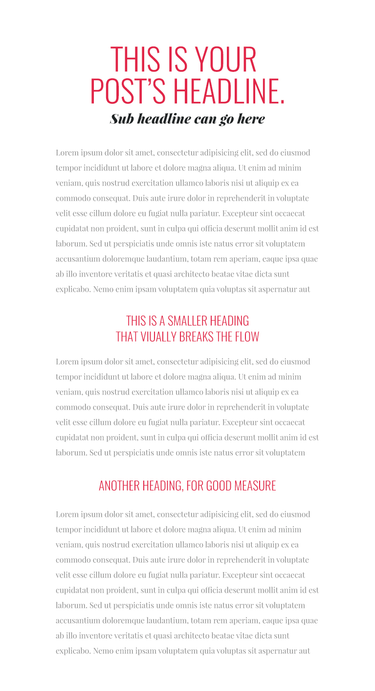
Sub Headline – Playfair Display Black Italic • 27px • #202425
Headings – Oswald Light • 63px
Body – Playfair Display Regular • 16px • #898a8a
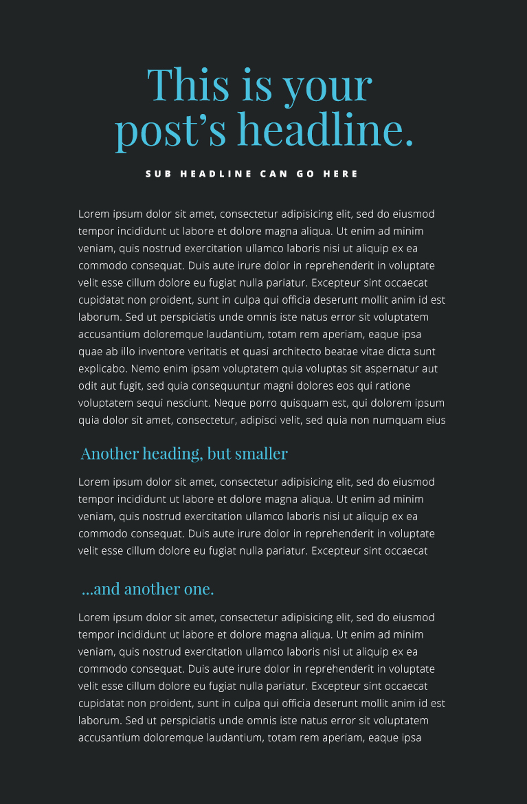
Sub Headline – Open Sans Extra Bold • 13px • #ffffff
Headings – Playfair Display Regular • 23px • #49c1df
Body – Open Sans Light • 15px • #d6d7d7
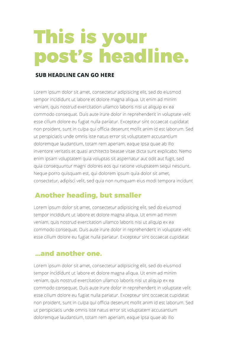
Sub Headline – Open Sans Extra Bold • 18px • #202425
Headings – Montserrat Black • 23px • #c1d774
Body – Open Sans Light • 15px • #202425