What the Apple Watch Means for User Interface
The Time Has Come.
Ha. See what I did there?
As any fanboy, tech nerd, or early adopter knows, Friday started the first wave of deliveries of the long-anticipated Apple Watch. As a guy that relishes new tech, and being the first person to have one, you better believe I was up at 3AM 2 weeks ago and promptly back to sleep at 3:15AM, basking in my proficient fanboy pre-ordering ritual.
Of course I flip-flopped back and forth for weeks prior to this point, even funding the Kickstarter campaign for the Pebble Time. I had my reasons:
- Pebble was on their 3rd gen, Apple was on their first gen
- Battery life concerns
- Cost
- Etc…
But at the end of the day, if this thing catches on, it can change the interactive/digital landscape as we know it. Remember 2010 when the original iPhone didn’t support flash? Yeah, neither do I. Flash in today’s web landscape has been abolished (good riddance), but remember all those people up in arms because Flash wasn’t available on iOS? How about iPads 2 years later? People said it was basically a giant iPhone. Now everyone has a tablet (or actually a giant iPhone! – thank Samsung for that one.) So while many aren’t necessarily clamoring to be able to ping their wallet from the other room with their Tile Bluetooth locator or using Apple Pay with the new watch without awkward fumbling out my giant phone waiting for the cashier to fumble through their point of sale system.
For a guy that fancies himself to be Tony Stark/Iron Man – this is pretty much the easiest decision I’ve ever had to rationalize for a purchase.
But what will this mean for the rest of the world and this post Web 2.0 Era of minimal user interface design? Well much like Mr. Stark in the movies, what this means is the further blurred line between our digital interfaces and our everyday lives. If you’re able to get your hands on the watch or have seen it in the preview shots/videos one of the first things that pops out is the stark (no pun intended) contrast that you’re used to on your iPhone/iPad interface. It’s completely black with the various inputs accented to show buttons and interaction points. Seamlessly integrating with your life without getting in the way or demanding focus or attention.

This is a trend that started as early with later versions of Android and to a smaller extent iOS 7. Gone are designs and UI/UX mainstays like actual physical buttons (for the most part). Apple started it with iOS 7 with stripping away the skeuomorphism that was the norm up until iOS 6.
A skeuomorph is a derivative object that retains ornamental design cues from structures that were necessary in the original.Examples include pottery embellished with imitation rivets reminiscent of similar pots made of metal and a software calendar that imitates the appearance of binding on a paper desk calendar.
And if you’re like any human on the Earth, you likely didn’t like it because simply humans don’t like change. We are creatures of habit. But somewhere along the line, you forgot what you were so upset about because now what is important to you: a photo, a Facebook comment, an email, is now propped up on that pedestal without various window dressings to distract us from why we all have these devices in the first place. As the old saying goes: “Life begins at the end of your comfort zone…”
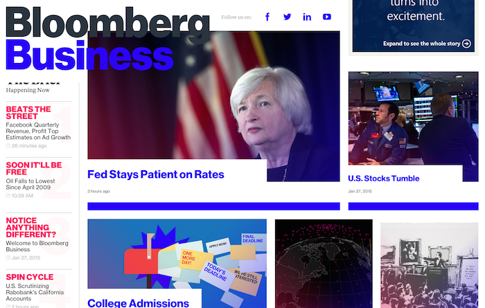
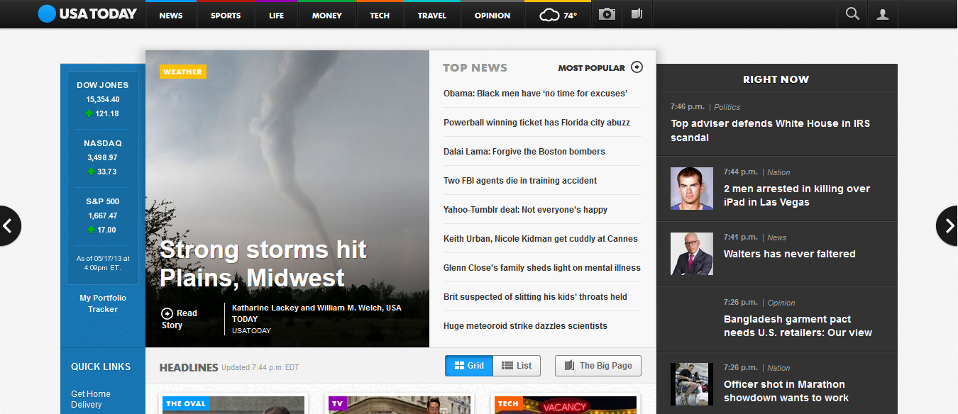
This type of design aesthetics is a direct homage to sci-fi heads up displays where information, content and prompts are the main attraction as opposed to superfluous design elements or textures. But you don’t need to be a comics nerd to appreciate this. Think about some of the recent redesigns of the modern landscape of the web:
In designs like these, the most important elements are spacing and typography. Traditional elements that are typically afterthought to the common business owner – but do so very much when it comes to giving your website a distinct personality. And of course content, which is still King.
More importantly, as content focused minimal design takes hold the real winner is the user. Because with more minimal website designs, means less elements made of image based assets – meaning smaller load times, and better over clarity of elements across devices. As more and more design elements are rendered in pure code, the benefit is that elements can be scaled to any resolution without sacrifice to quality on your shiny high pixel density/retina/HD displays. Thus yielding an enhanced user experience and a level of polish for your brand online. Because nobody likes a pixelated logo.
It’s important to make sure your development team is in tune to new trends and advances in HTML5/CSS. A lot of times, clients want to make sure that their sites are compatible with older browsers, but its equality important to remember that doing so limits your ability to embrace advances in technology for the greatest user experience – after all updating your desktop internet browser is free.


